LABEL DESIGN
These are some of the best labels I designed & mocked up to present to executives for new brand concepts. A few of these made it to the final stages and will be printed for products heading to market.
Desert Spoon (above) is the brand that taught me just how many choices there are when it comes to designing a bottle. As a designer in the liquor industry, you do really have to feel and taste the brand in order to achieve a fantastic, finished product; all the while telling the story of the juice behind the name. With research on many different styles for the desired sleek design, we decided on a black half rubber dip to give the bottle a nice smooth feel when holding it in the hand. As beautiful as the bottle turned out, just imagine how beautiful it tastes.
Euforia
To celebrate Mexican heritage, Euphoria was inspired by colorful, majestic alebrijes: brightly colored Mexican folk art sculptures of fantastical creatures. The artwork was hand drawn & implemented into the design. Below is the label design, bottle mockup as well as an actual alebrije to show the inspiration. This is the first tequila brand I got to work on.
Casa De Valle
An agave wine cream blend that I created three labels for: Original, Coffee, and Mexican Chocolate.
Stella Rosa Tequila
Label concepts created for Stella Rosa, who are looking to add a tequila line to their expanding brand. The line is set to include a traditional blanco, reposado, añejo, and a few flavor profiles: Berry and Peach. The goal was to have a bottle and label reminiscent of a wine bottle but slightly different to bring attention to the new line of the brand soon to sit in the tequila section.
Atoyac
Atoyac Whiskey Mexicano is a mexican corn whiskey that was meant to own the "craft" look. The idea was for it to look modern but crafted from the earth just like the agave is. Using earthy tones, a splash of color, and rustic fonts; the final concept was perfect for the original vision. The icing on the cake was designing the seal for the topper. By implementing the corn graphic from the logo and more of the red color, the final product was born.
Wild Wild texas
For Wild Wild Texas Blended Whiskey, we wanted a beautiful look for the label. I originally went with ornate flourishes, a deep green background color, and a custom drawing in the logo. Through critiques, I decided to go with a more clean, yet elegant look: a clear label. The new design now features an outline of Texas which is made with metallic material to give it a shiny presence on the shelf. This version was widely loved and was selected as the final product. For this project I also created the box design to match the brand for shipping.
Jalisco select
Rebel WOlf
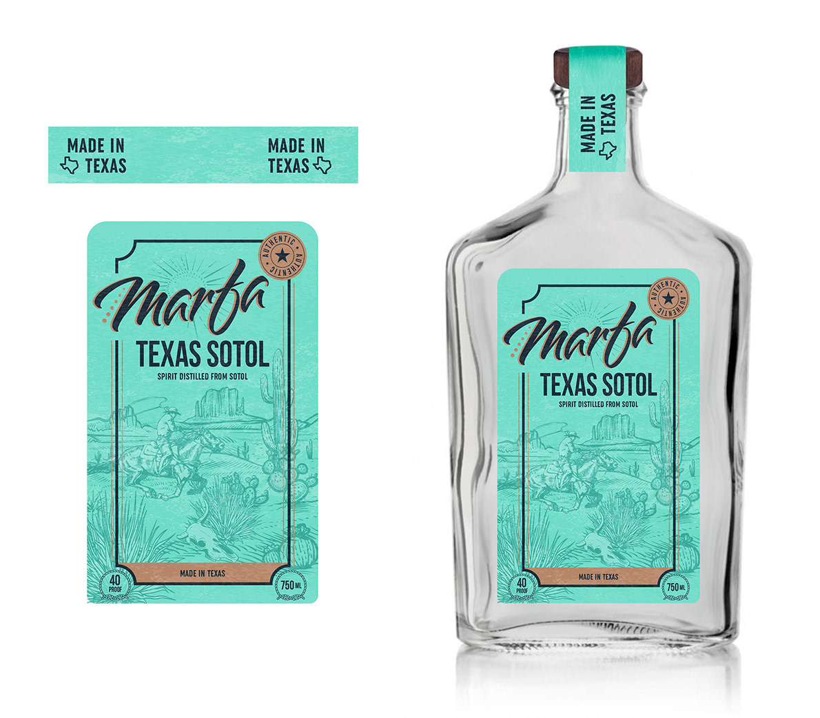
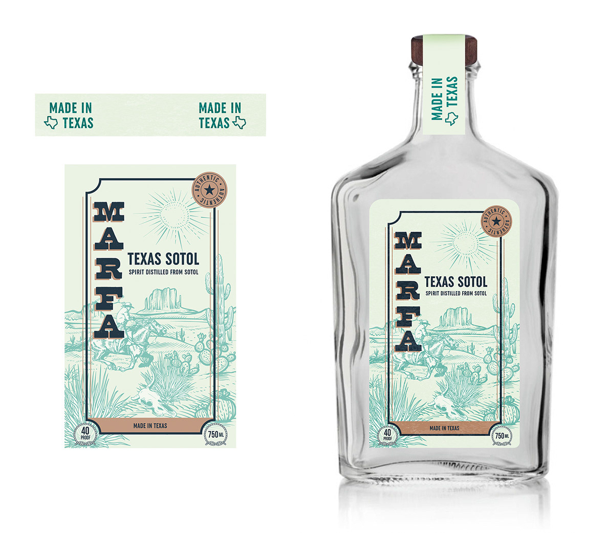
Marfa Texas Sotol


Solo Agave
As a new brand coming to me as a work in progress, an agency created and missed the mark on the vision of the label we had in mind. The requested look was "craft tequila" so I went with a light monochromatic color palette for both the blanco and reposado tequila.
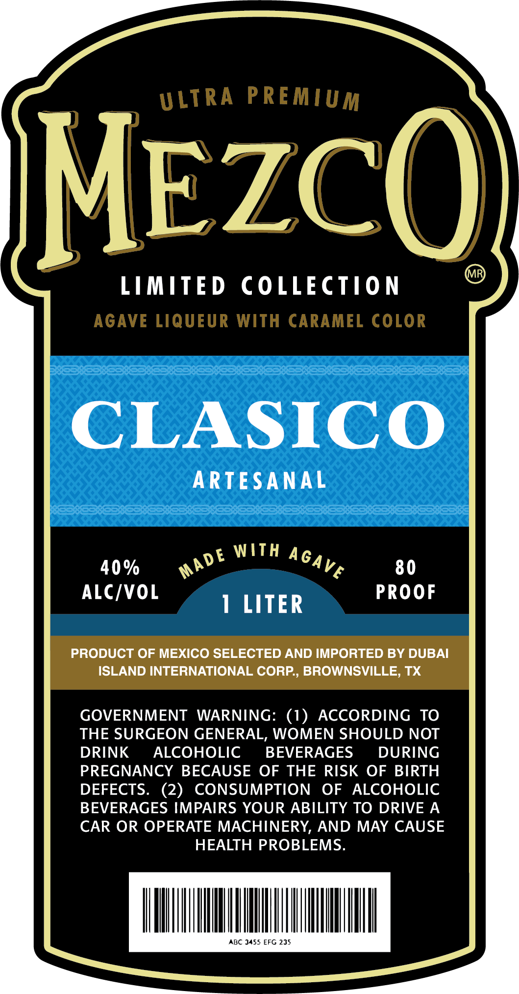
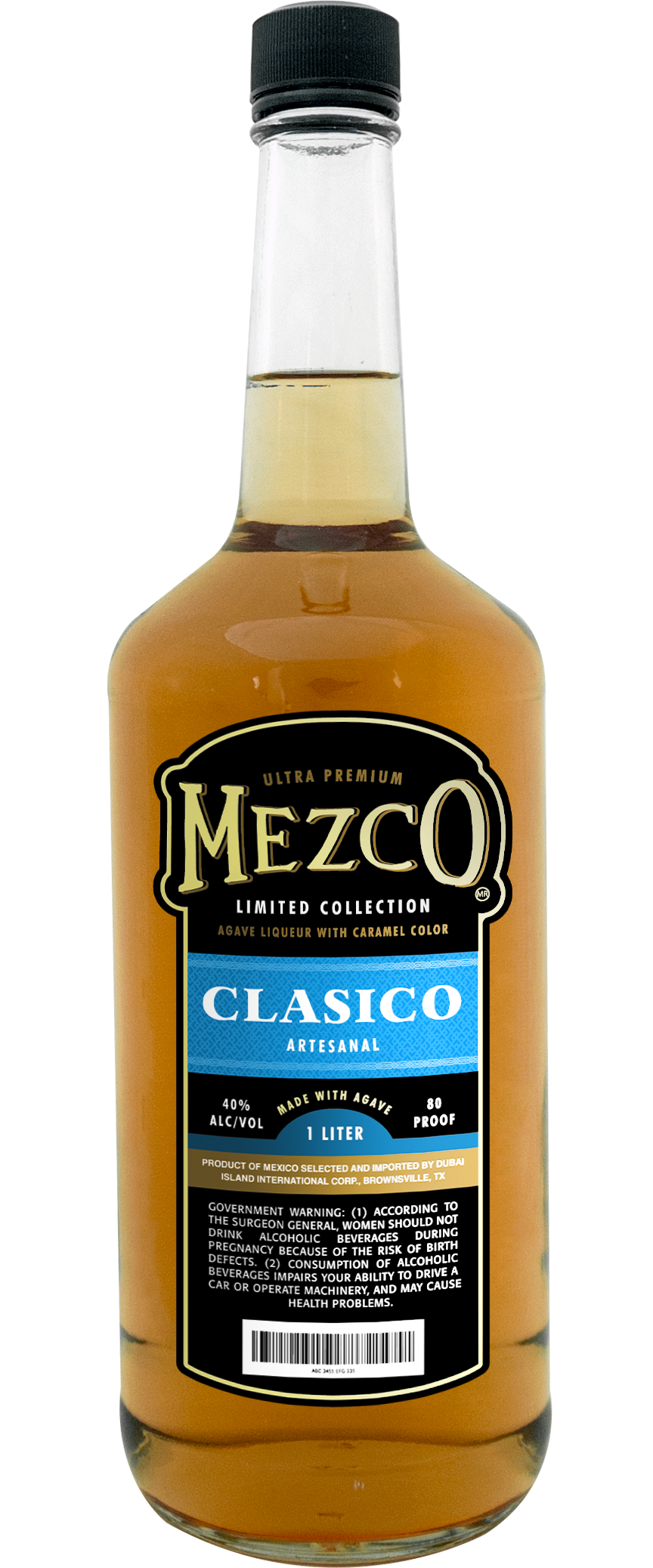
Mezco
I was tasked with making a slight redesign for Mezco. The main request was to give the label a better presence on the bottle as well as more of a splash of color to get away from their outdated black and yellow.


